Draft article — to be replaced with final copy.
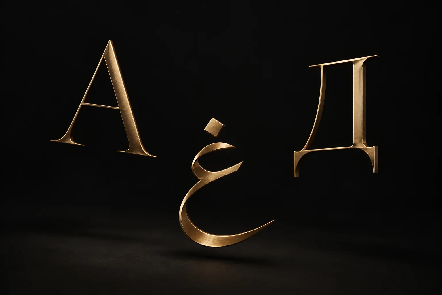
A brand that works in one alphabet is a sketch. A brand that has to work in Latin, Arabic and Cyrillic is a system, and most identities are not built as one. They are designed in English, approved in English, and then handed to someone else to “do the Arabic version”.
Why alphabets break identities
Each script brings its own rules. Arabic reads right to left, joins its letters, and sits differently on the line. Its letterforms are taller in places and lower in others, so a wordmark tuned to Latin x-heights suddenly looks too small or too heavy next to it. Cyrillic shares some shapes with Latin but adds many of its own, and a typeface that only half supports it falls back to a system font the moment someone types a Russian or Serbian name.
Numbers and punctuation add their own surprises. Arabic text can use Western or Eastern Arabic numerals, quotation marks and commas change shape, and a price that looks tidy in English can wrap awkwardly once the currency moves to the other side. Small details, but they are the ones customers see every day.
The problems rarely show in the logo presentation. They show six months later: on a shop sign in Dubai where the Arabic line is squeezed to fit, on a brochure where the Cyrillic headline is set in a different font, on a social post where the layout was mirrored by hand and the logo ended up on the wrong side.
None of this is a translation problem. It is a design decision that was never made, so it gets made by whoever is closest to the deadline.
What to test first
We now test the hardest script first, not last. Before a direction is approved, it has to survive a short set of checks in every alphabet the brand will use:
- The wordmark and a two-line lock-up, set side by side in each script, at small and large sizes.
- A headline, a paragraph and a price in each script, using the real typefaces, not placeholders.
- One mirrored layout for right-to-left use, to see what moves and what must stay fixed.
- The longest real word or name the client expects, to see where lines break.
Typeface choice usually decides the outcome. We look for families that cover all three scripts with matching weights, or for pairs that were designed to work together. If the perfect Latin face has no Arabic partner, it is often better to choose a slightly less exciting face that does.
We also involve a native reader for each script early. A designer can judge balance and spacing; only a reader can tell you that a word looks childish, old-fashioned or simply wrong.
The handover checklist
An identity that works in three alphabets is only useful if the next person can use it without asking. The handover therefore includes more than logo files:
- Lock-ups for each script and each combination, with clear space and minimum sizes.
- Font files and licences for every script, and the fallback to use when they are not available.
- Rules for mirroring: which elements flip for right-to-left layouts and which never do.
- Approved examples of real copy in each language, so suppliers can see what good looks like.
- One named owner on the client side who signs off new applications.
We hand all of this over in a shared folder the client owns, not as a one-off PDF, so it can be updated when a new market or a new supplier comes in. The next agency, or the in-house team, should be able to open it and continue without calling us.
It takes a little longer at the start. It saves the brand from slowly turning into three different brands, one per alphabet, each made by a different supplier.